Strange Maps

White text on a light gray background reads "Strange Maps" in a large, decorative font.
The world, seen sideways

Most maps show the world as something to be navigated. Strange Maps reveals the worlds humans have imagined.

Since 2006, Frank Jacobs has been collecting and interpreting maps that do more than chart geography or political borders. These maps — often obscure, beautiful, funny, and deeply revealing — each tell a story, usually one that’s more about how we see ourselves than where we are.

Published as a book in 2009 and a Big Think column since 2010, Strange Maps draws on a steady stream of reader submissions and rare discoveries. Together, they offer a way of seeing the world from unfamiliar angles, where cartography becomes culture, argument, and art.

with

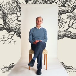
Frank Jacobs is a journalist whose work explores how culture, history, and imagination shape the way we see the world.

Full Profile
strange maps
“The Chinese Job”: Spain’s wild 1580s plan to conquer the world — via Beijing
The plan — conquer China and push west to attack the Ottomans — was peak imperial hubris, as the Spanish themselves eventually realized.

Frank Jacobs

A color-coded map of Asia shows four migration phases from China, with arrows pointing toward Papua New Guinea and the Andaman Islands, both circled in yellow.
Aerial map view highlighting the Humongous Fungus in red within Malheur National Forest, with labeled sections "Genet D" and "Genet E." A scale bar indicates 2 kilometers.
A member of a species that kills trees, this mushroom is not the first to be called the Humongous Fungus — and perhaps not the last.
World map highlighting the Brandt Line, dividing the Global North and Global South across continents.
In 1980, Willy Brandt drew a line across the map that still influences how we think about the world.
Map showing tidal ranges in northern Europe. Notable locations include Severn Estuary, Mont Saint Michel Bay, and Gibraltar. Depths indicated in meters and feet.
Great tidal ranges are relatively rare on a global scale — and can be very deadly to the unsuspecting foreshore walker.
Map of the Sovereign State of the Bektashi Order, showing key locations such as the World Headquarters and Library, with details on independence, language, religion, government, and currency.
The Sovereign State of the Bektashi Order would be just one quarter the size of Vatican City.
A map depicting historical migration paths with two human figures positioned in different regions, illustrating ancient travel routes. The map shows various colored regions representing different terrains.
Early modern humans interbred with Neanderthals — and scientists recently pinpointed a key site of contact.
A map showing a proposed power transmission route from Darwin, Australia to Singapore, spanning 4,300 km, with sites for electricity supply, battery storage, and solar generation indicated along the route.
Australia's AAPowerLink boasts three global superlatives: largest solar farm, largest battery, and longest power cable.
Map of Greece with different surname suffixes highlighted by region, such as -akis, -opoulos, -adis, and -oglou. Inset displays Cyprus with the suffix -ou.
The hidden story behind Greek surnames and how they trace family origins across the country — starting with the name of a would-be U.S. president.
A world map displays global climate zones with colors representing varying levels of temperature and precipitation: green for temperate, yellow for arid, orange and red for hotter regions, and blue for wet zones.
The salinity of the oceans is not just a matter of taste. Saltier water behaves differently, too.
A historical timeline featuring notable figures from 1400 to present, including scientists, writers, politicians, and artists. The timeline is categorized by different historical eras.
"The Big Map of Who Lived When" plots the lifespans of historical figures — from Eminem all the way back to Genghis Khan.
This graph shows the highest recorded temperatures in five Middle Eastern cities from 2010 to 2020. The temperatures range from 49.9°C to 53°C. An inset map highlights the locations of the cities.
You could call this rectangle covering parts of Iran, Iraq, and the Arabian Peninsula the “Oven Window.”
Four images of tennis matches on grass courts, showing different stages of play, each with two players. The courts show varying degrees of wear from fresh to significantly worn.
How has tennis changed in recent decades? The wear and tear on Wimbledon’s Centre Court may tell the tale.
An old building with visible sections from four eras labeled: "REPUBLIC ERA," "OTTOMAN EMPIRE," "BYZANTINE EMPIRE," and "ROMAN EMPIRE" from top to bottom. Left side shows the building; right side shows the labeled eras.
19 rooms. 1,636 square feet. 1,800 years of history.
A map of Australia showing probability of species presence with color gradients from low (blue) to high (red). Insets display detailed regions. Arrows indicate the Northern and Southern entry points.
A new method of mapping migration factors in erratic movements and changing climate.
A map with various yellow and brown faces showing different emotions, representing different regions.
50 years ago, Herman Chernoff proposed using human faces to represent multidimensional datasets. It was a good idea in theory — but a disaster in practice.
Map of the world showing tropical cyclone tracks from 1985 to 2005. Paths are marked with lines indicating storm movement over time. Dense clusters appear in the North Pacific, North Atlantic, and the Indian Ocean.
Thanks to the Coriolis force, hurricanes never cross the equator.
Line chart showing body mass index (BMI) trends for various countries. Lines are labeled by country, with silhouetted figures for normal, overweight, and obese categories on the left.
Waistlines are expanding in most countries, except for a skinny list of nations bucking the trend.
A Venn diagram depicts the overlapping groups of Nordic countries, Scandinavia, Danish Realm, Baltoscandia, Finno-Ugric, Baltic countries, and Balts, with the flags of respective countries.
Because of their large and unfriendly neighbor to the east, the Baltics would rather be Scandinavian.
A fictional map of a continent named eneropa, showing various regions like tidal states, ccsr, and solaria with topographical details and a scale.
A radical proposal reimagines Europe as a carbon-neutral continent where national boundaries are replaced by regions defined by renewable energy capabilities.
World map illustrating various countries color-coded by their happiness levels with symbols indicating the most and least happy countries in each region.
The Gallup World Poll reveals regional peaks and valleys of happiness across all of the continents.